Community Brand Identity - Social GrouoTHE BRIEF
A brand for a community social group in Orlando — built to foster genuine connection in a city that can feel transient. The identity needed to feel inviting and intimate, the visual equivalent of a handwritten note slipped under a door.
THE APPROACH
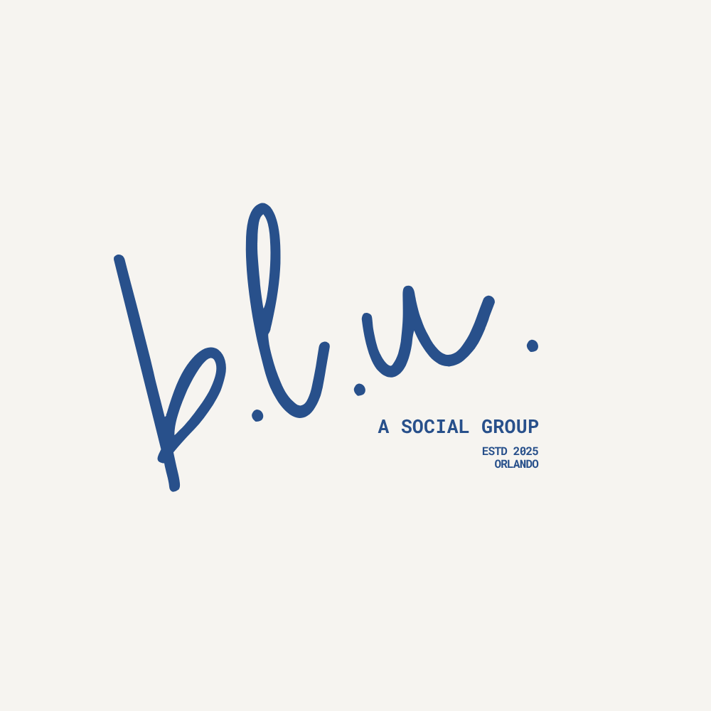
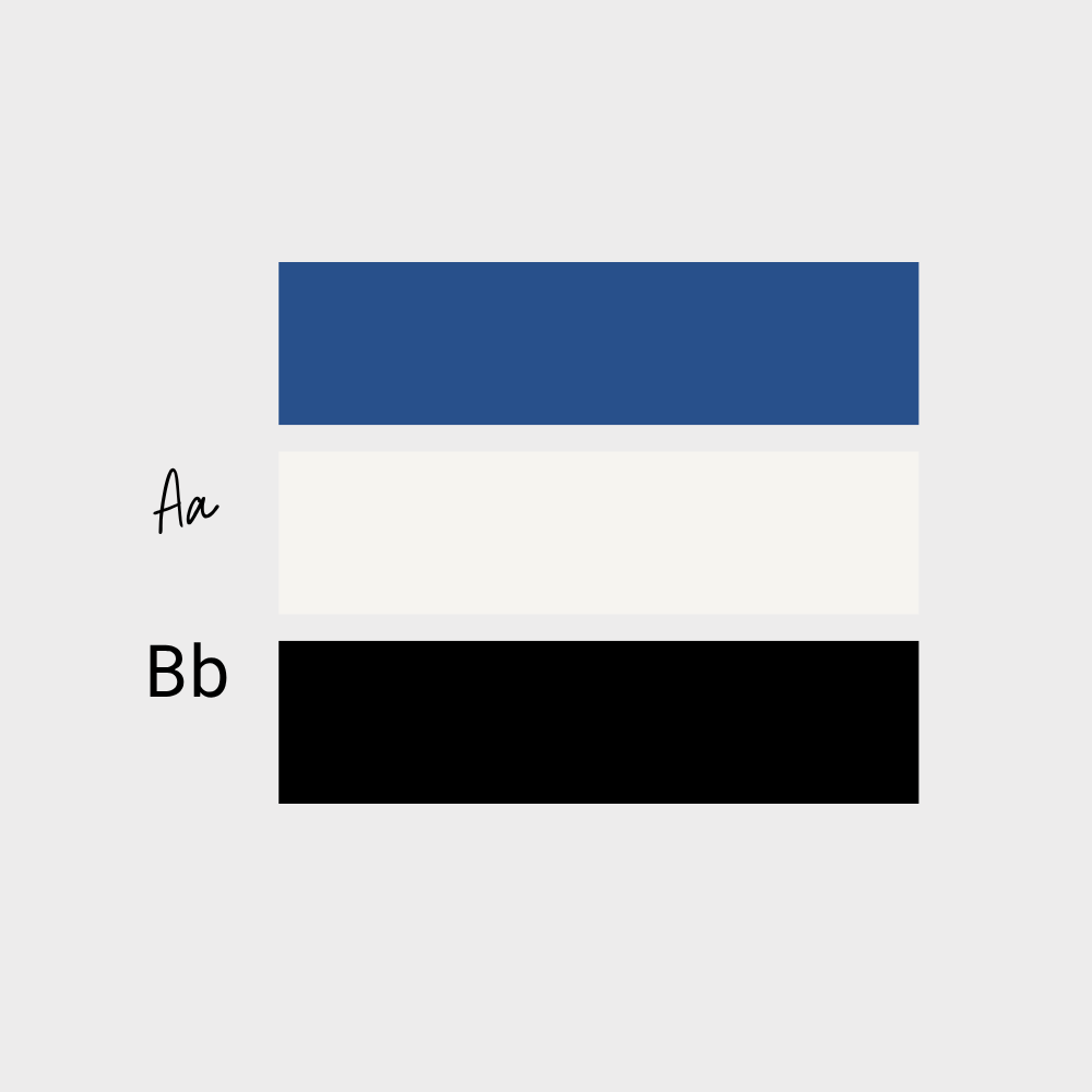
The script logotype mimics the gesture of handwriting — intentional, personal, a little imperfect in the best way. The periods after each letter slow the reader down, creating pause and presence, turning an abbreviation into something that feels considered. Deep navy was chosen to communicate sincerity and a certain seriousness of purpose — this isn't a party flyer, it's an invitation to belong somewhere. The founding details (Estd. 2025, Orlando) are set small and tight, giving the mark the feeling of something that will age gracefully.
DELIVERABLES
Brand name concept, script logotype, founding details typesetting, color palette..