Product Brand Identity - Food IndustryTHE BRIEF
A self-initiated concept built around a single dish: the arepa de huevo, a deep-fried corn cake from Colombia’s Caribbean coast. The challenge was to create a brand identity that could carry real cultural weight — rooted in family memory and regional specificity — while feeling contemporary enough to function as a viable food business from day one.
THE APPROACH
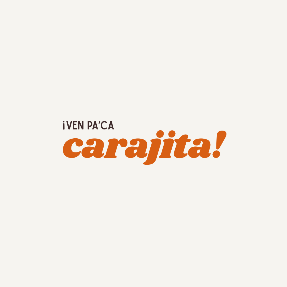
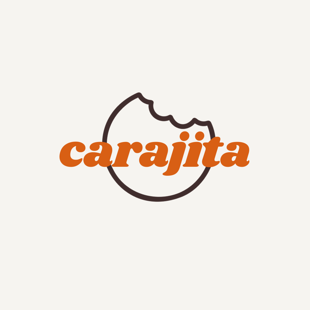
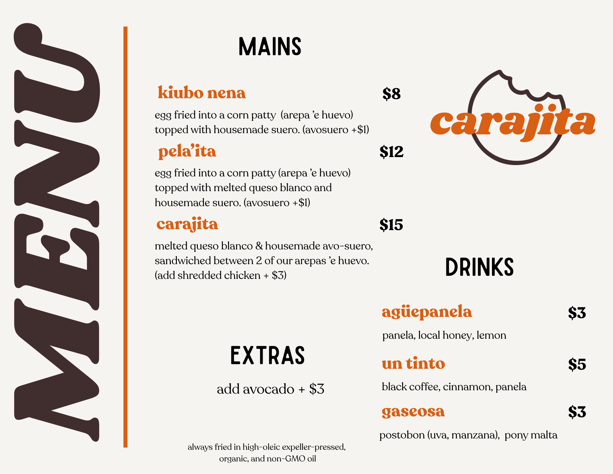
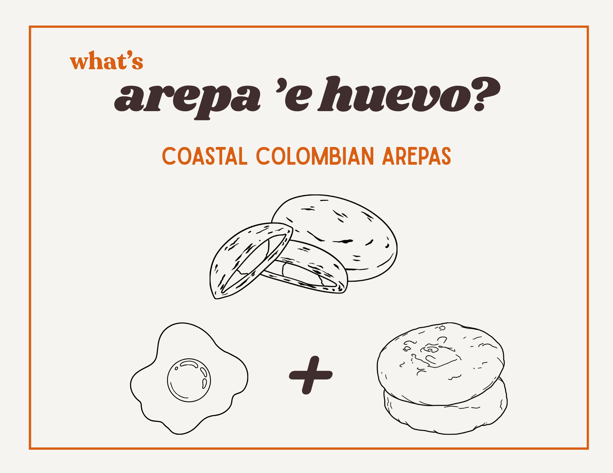
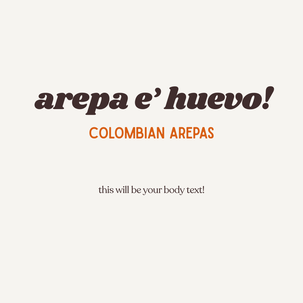
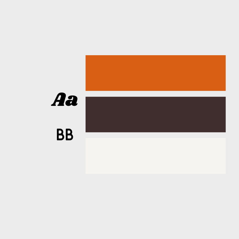
The name carajita — affectionate, spirited Colombian slang — established the brand’s personality before a single visual decision was made. Warm but unsentimental. Specific but inviting. The wordmark leans into a retro italic serif in burnt terracotta, a nod to the golden crust of the arepa itself. Paired with a dark espresso brown and a warm cream ground, the palette reads as food-world without defaulting to the expected. The secondary mark — a broken circle, a bitten arepa — gives the system a playful lockup option and a built-in visual joke that rewards attention. Brand voice follows the same logic: ¡ven pa’ca! as a headline, menu items named la nena, pela’ita, and carajita in a tiered structure that doubles as storytelling. An explainer slide — what’s arepa ’e huevo? — bridges cultural context for new audiences without condescending to the ones who already know.
DELIVERABLES
Wordmark, icon mark, color system, typography hierarchy, menu design, and brand positioning and voice — a full identity foundation built to scale.