Product Brand Identity - Healthcare TechnologyTHE BRIEF
Compass is an online tool designed to help families navigate federal inspection data for elder care facilities — making intimidating government information feel accessible, trustworthy, and humane. The brand needed to communicate authority without coldness, and warmth without naivety.
THE APPROACH
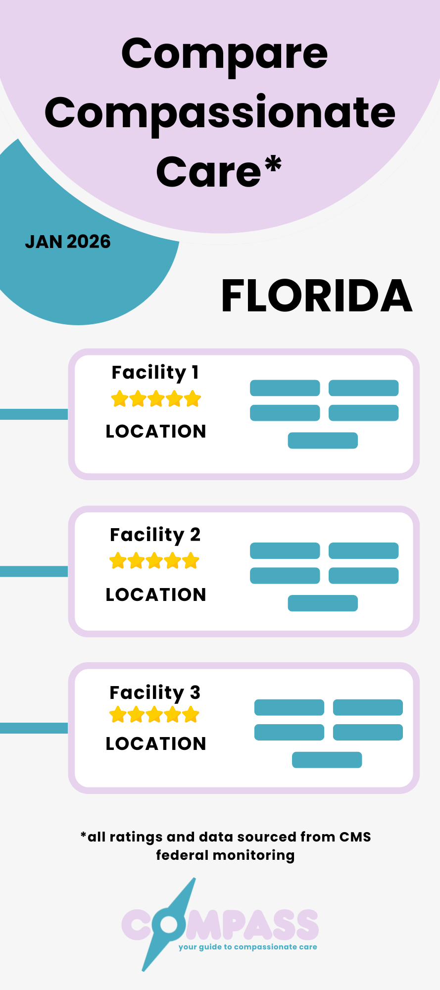
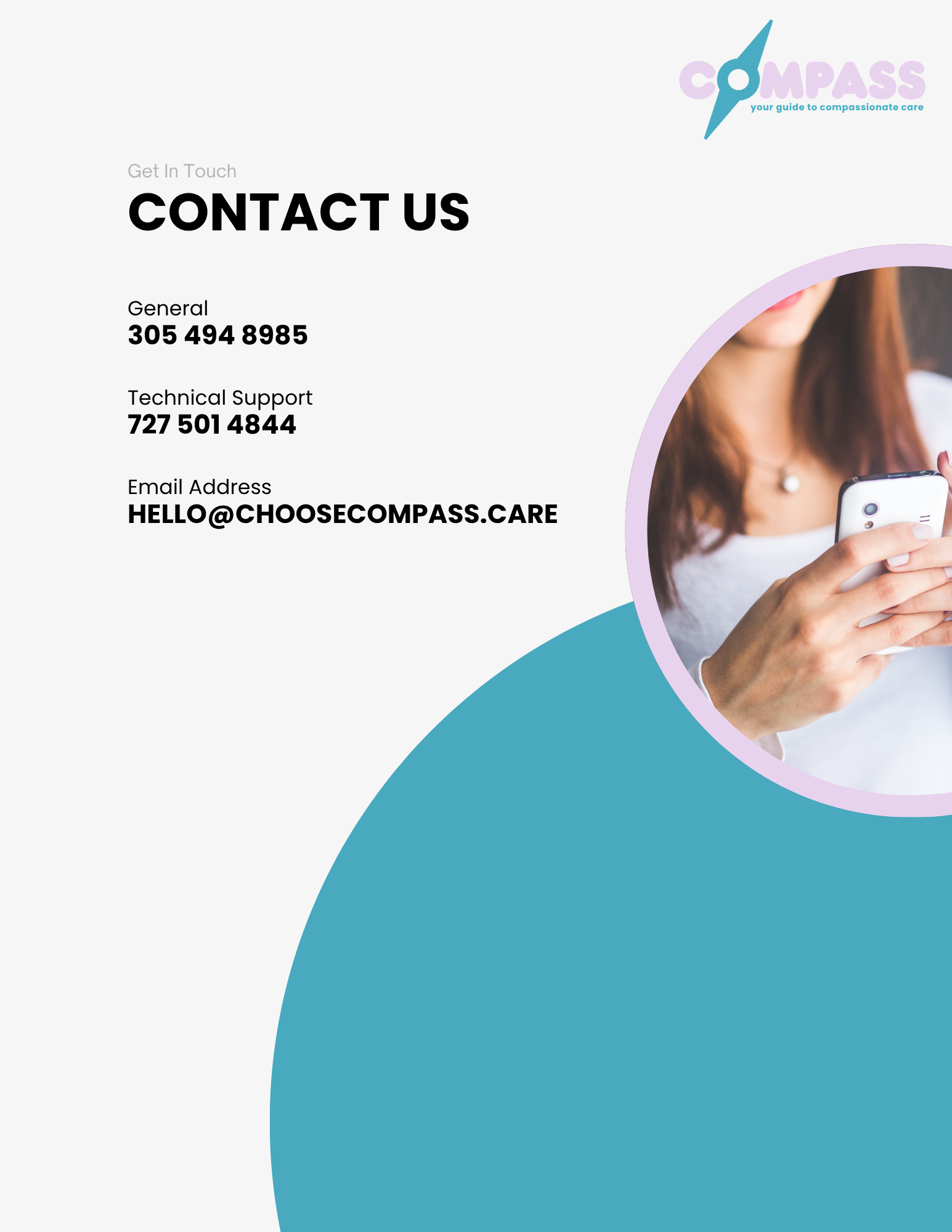
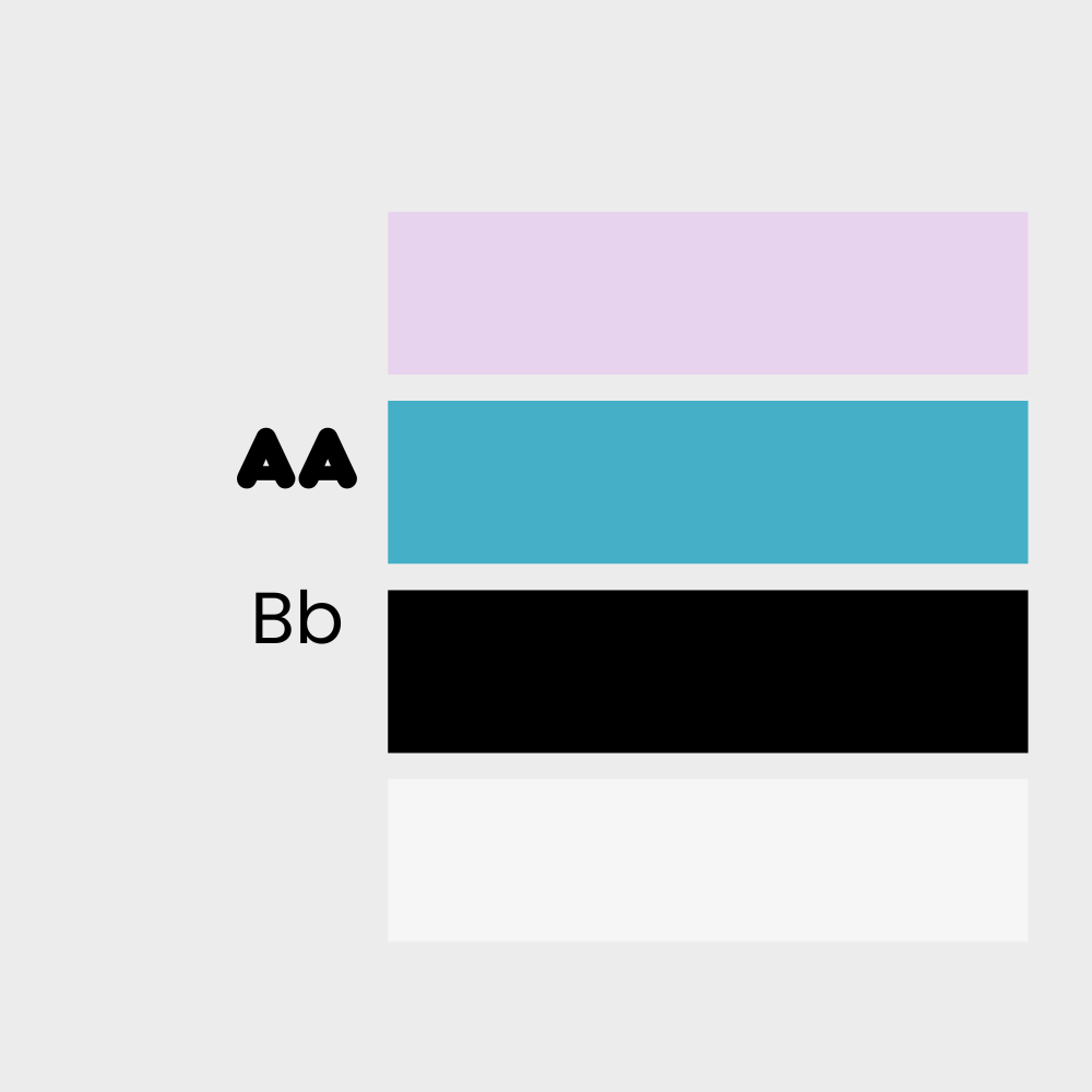
The compass needle integrated into the lettermark does dual work: it signals navigation and direction while visually anchoring the "O" as a focal point — a lens through which clarity is found. The palette of soft lavender and teal was chosen deliberately to distinguish Compass from clinical healthcare blue-and-white conventions, while remaining trustworthy. The tagline — your guide to compassionate care — shifts the frame from data to humanity. Full brand collateral including a 2026 Partner Kit and facility comparison template demonstrates the system in use for in-office print materials.
DELIVERABLES
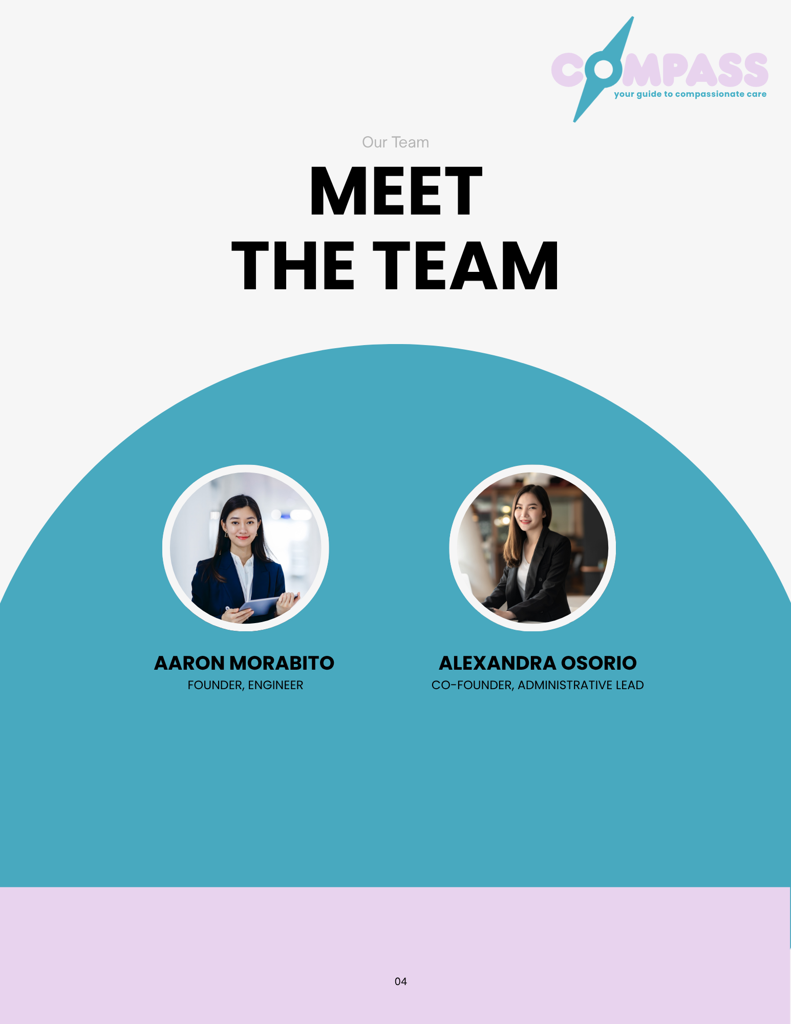
Logo system, color palette, tagline, full partner kit including copy, infographic templates, brand name and positioning concept.